Typography
Load a Google Font and set the size, weight, and spacing for body text, navigation, and every heading level.
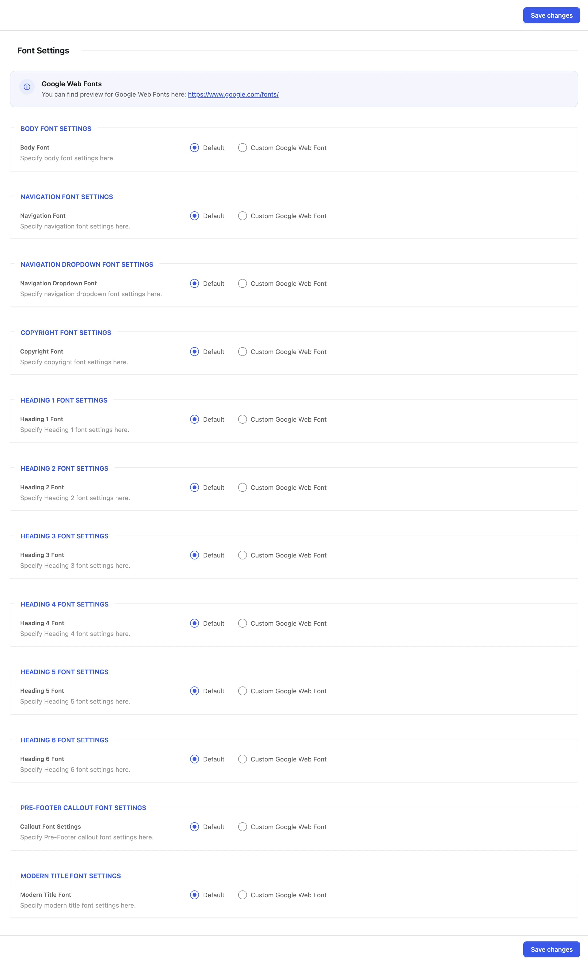
Font Settings lets you swap the theme's default typeface for a Google Font and, once you do, fine-tune its size, weight, line height, and letter spacing, separately for body text, navigation, dropdowns, the copyright line, each heading level, the pre-footer callout, and the "modern" title style.
Where to find it: Go to HighendHighend OptionsFont Settings.
Fluid Typography
Offhb_fluid_typographyHeadings, element font sizes, and row and column padding scale down smoothly on smaller screens instead of staying a fixed size. Large values shrink more, while body-sized text barely changes. Any setting whose label ends in "on Phones", such as Top Padding on Phones in a row's Layout tab, sets that phone value exactly instead of relying on the automatic scale.
How each group works
Every group starts collapsed to a single choice: Default (the theme's built-in typeface and sizing) or Custom Google Web Font. Switching to Custom Google Web Font reveals the rest of that group's controls and automatically loads the chosen font from Google Fonts. You don't need to enqueue anything yourself. Leaving a group on Default ignores every other field in it.
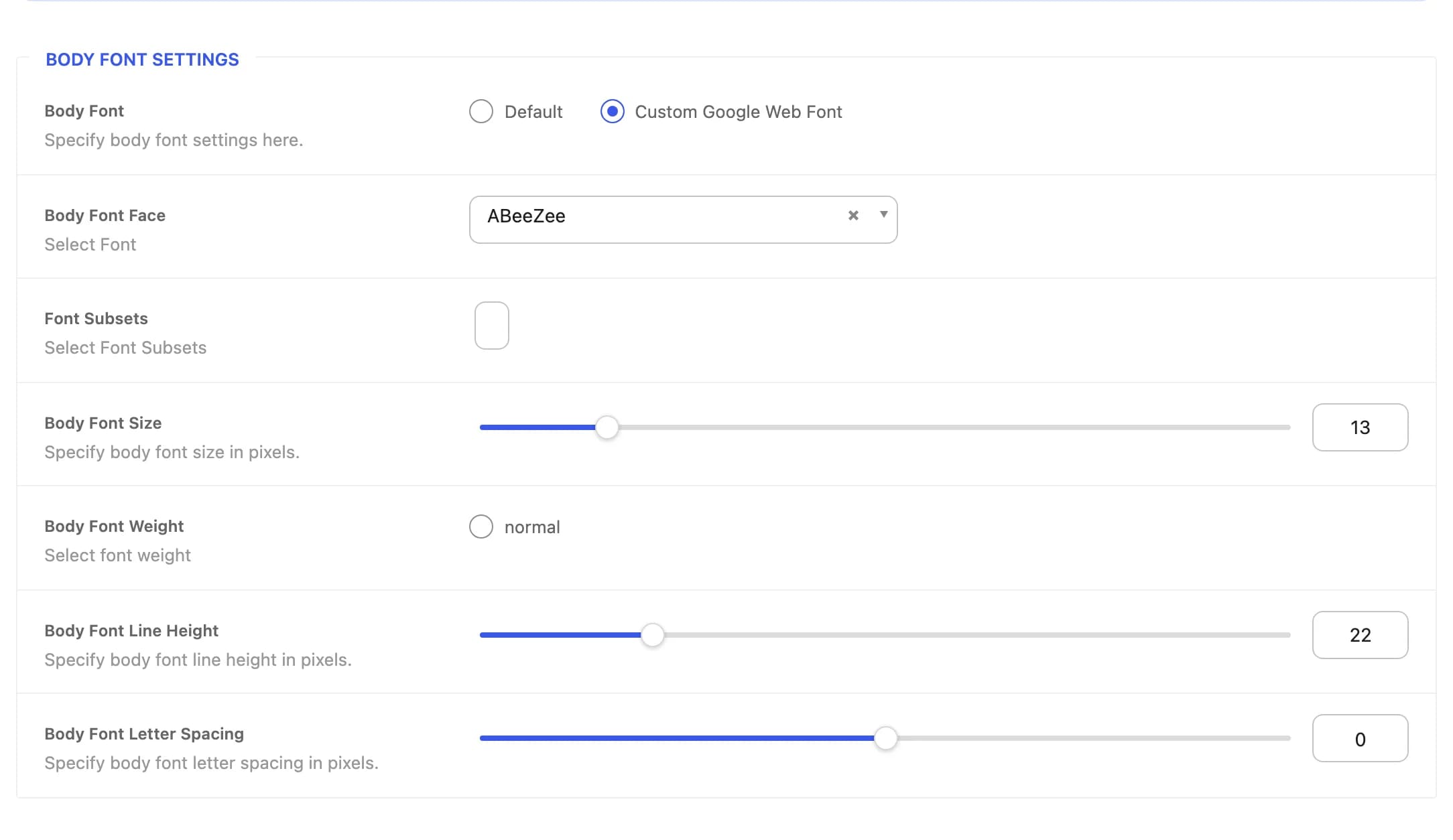 Font Face, Font Subsets, Size, Weight, Line Height, and Letter Spacing.
Once expanded, most groups share the same controls:
The Google Font family to use, pulled live from the Google Fonts library.
Character subsets to load for the chosen font (for example Latin, Cyrillic, Vietnamese). Only load the ones your content needs.
Font size in pixels. Range and default vary by group; see the table below.
Font weight. The choices shown depend on which weights the selected Font Face actually provides.
Line height in pixels, from 1 to 100.
Letter spacing in pixels, from -5 to 5.
The Navigation, Navigation Dropdown, and Modern Title groups add one more field, Uppercase Text (a switch, off by default), which uppercases that element's text.
The Modern Title group only sets the font face, weight, and letter spacing. Its size and line height come from the heading level the title uses.
Which elements each group styles
| Group | Default size | Default line height | Styles |
|---|---|---|---|
| Body Font | 13px | 22px | Body text site-wide. |
| Navigation Font | 13px | 22px | Main navigation and side navigation menu items. |
| Navigation Dropdown Font | 12px | 22px | Sub-menu dropdowns and mega menu columns. |
| Copyright Font | 12px | 22px | The copyright line and its links, at the bottom of the footer. |
| Heading 1 Font | 30px | 36px | <h1> elements, including page titles. |
| Heading 2 Font | 24px | 30px | <h2> elements. |
| Heading 3 Font | 20px | 26px | <h3> elements, including callout box headings. |
| Heading 4 Font | 18px | 24px | <h4> elements, widget titles, and comment headings. |
| Heading 5 Font | 16px | 22px | <h5> elements and the testimonial author name. |
| Heading 6 Font | 16px | 22px | <h6> elements. |
| Pre-Footer Callout Font | 13px | 22px | The pre-footer callout strip's text. |
| Modern Title Font | — | — | The "modern" title style (used by page builder title elements set to that style), independent of the regular heading levels above. |