Overview
What Highend elements are, how to add them with WPBakery or as shortcodes, and the settings most elements share.
Highend elements are the theme's own library of WPBakery Page Builder building blocks: buttons, icon boxes, sliders, pricing tables, carousels, and more. Each one is a WordPress shortcode under the hood, mapped into WPBakery so you can configure it with a settings panel instead of typing attributes by hand.
Add elements in WPBakery
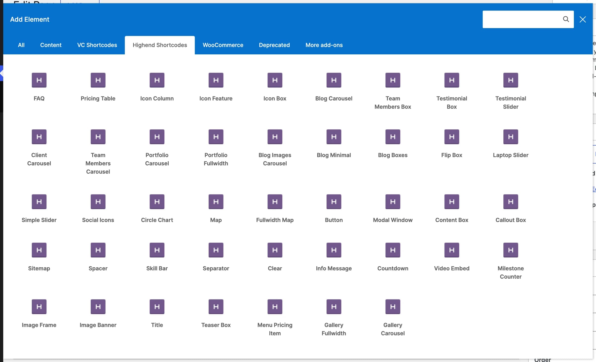
Every element in this section shows up in WPBakery's Add Element dialog, grouped under its own Highend Shortcodes category tab (alongside Content, VC Shortcodes, and WooCommerce).
Open a page in the page builder
Edit a page and switch from the block editor to WPBakery. Click WPBakery Page Builder in the toolbar. From there you can build in the Backend Editor (a drag-and-drop panel inside wp-admin) or the Frontend Editor (drag and drop directly on the live page). Both offer the same elements.
Click Add Element
Inside a column, click the + icon (or Add Element) to open the dialog, then select the Highend Shortcodes tab.
Pick an element and configure it
Click an element to insert it with its default settings, then double-click it (or use its pencil icon) to open its settings panel and fill in the fields documented on each element's page below.
These two elements still work, but WPBakery hides them from the main list; you'll find them under the Deprecated tab instead. Use a Row with its own Fullwidth Section and One Page Section options instead. See Fullwidth Section and One Page Section.
Use elements as shortcodes
Every element is also a plain shortcode, so you can type it directly wherever WordPress renders shortcodes, such as the Classic Editor, a Custom HTML block, or a page built entirely by hand.
If you're using the Classic Editor, click the Highend Shortcode Generator button in the toolbar. It opens a dialog where you pick a shortcode from a list, fill in a form, and insert the generated shortcode text, using the same fields as the WPBakery panel in a simpler form. See Shortcode Generator.
A handful of elements have no WPBakery mapping at all and are only available as shortcodes: icon, list/list_item, dropcap, highlight, tooltip, row/column/align_center, and a few others.
Common settings
Most elements share the same three fields, tucked under the Animation and Advanced tabs of their WPBakery settings panel. Element pages link back here instead of repeating them.
NoneanimationAnimates the element in when it scrolls into the browser's viewport. Options: None, Fade In, Scale Up, Scale Down, Right to Left, Left to Right, Top to Bottom, Bottom to Top, Rise In, Helix, Flip-X, Flip-Y, Spin. Rise In fades the element in while it moves up and settles to its full size. WPBakery's own elements use the CSS animation setting instead, which has the reveal animations.
animation_delayDelay before the entrance animation starts, in milliseconds. Only has an effect when Entrance Animation isn't None.
classAdds a CSS class to the element's wrapper, so you can target it in custom CSS.
A smaller group of layout elements (Fullwidth Section, One Page Section, Separator) also have Margin Top and Margin Bottom fields under a Position tab; those are documented on each element's own page.
Browse elements
Layout
Fullwidth Section
Deprecated full-width background section. Use a Row instead.
One Page Section
Deprecated one-page anchor section. Use a Row instead.
Columns
The row, column, and center-align shortcodes behind every layout.
Spacer
A blank spacer with a specified height.
Separator
A line separator with extra styling options.
Clear
Clears floated elements.
Layout Block
Shows a Layout Block inside a page, edited in one place.
Typography
Title
A heading with 29 preset styles.
Button
A button with 25 colors, 3 sizes, and optional icon.
Animated Button
A button with a text roll, an animated arrow, and Solid, Outline, Glass, or Text styles.
Icon
A single icon with size, color, and link options.
List
An ordered, unordered, or custom icon list.
Dropcap, highlight & tooltip
Three inline text helpers for use inside a paragraph.
Fit Text
A word sized to fill its column's width exactly, like a large wordmark.
Scrolling Text
A band of text that moves with the page scroll or auto scrolls.
Content Boxes
Icon Box
A styled content box with an icon.
Icon Column
A simple content column with an icon.
Icon Feature
A fancy icon feature.
Content Box
Shows any content in a styled box.
Teaser Box
An image teaser box.
Flip Box
A box that flips on hover.
Callout Box
A styled callout box with an optional button.
Info Message
A notification box in info, success, warning, or error style.
Modal Window
Shows content in a modal window.
Toggles & Accordions
Collapsible toggle and accordion panels.
Data & Pricing
Milestone Counter
A customizable animated number counter.
Stat
A large number with a smaller suffix that can count up.
Skill Bar
A single animated skill/progress bar.
Circle Chart
A customizable circular percentage chart.
Countdown
A countdown timer for a date and time in the future.
Process Steps
Numbered process steps.
Pricing Table
Displays one of your pricing tables.
Menu Pricing Item
A restaurant-style menu item with a price.
Media
Stacked Images
Layered images on a shaped stage with reveal animations.
Circle Images
A row of round images, for example an avatar stack.
Image Frame
An image with a frame and hover options.
Image Banner
An image banner with overlay text.
Video Embed
Embeds a video from YouTube, Vimeo, or similar.
Simple Slider
A simple image slider.
Laptop Slider
A slider within a laptop mockup image.
Gallery Fullwidth
A fullwidth gallery section.
Gallery Carousel
A carousel of gallery items.
Posts & Listings
Blog Carousel
A carousel of blog posts.
Blog Images Carousel
A blog carousel focused on featured images.
Blog Minimal
A simple blog list.
Blog Boxes
Blog posts in boxed cards.
Portfolio Carousel
A carousel of portfolio items.
Portfolio Fullwidth
A fullwidth portfolio section.
Team Members Box
A grid of team member boxes.
Team Members Carousel
A carousel of team members.
Testimonial Box
A single testimonial item.
Testimonial Slider
A testimonial slider.
Client Carousel
A carousel of client logos.
FAQ
An FAQ module with category filtering.