Stacked Cards
Turn a row's inner rows into cards that stick and animate as the page scrolls: stacking in place, sliding sideways, or drifting in an endless strip.
The Stacked Cards tab, on rows, turns the row's inner rows into cards. It has three kinds of effect: stacking effects, where each card sticks near the top of the screen and animates out of the way as the next card arrives to cover it, a bit like a deck of cards being dealt; Horizontal, where the row itself stays in view while the cards slide sideways as the page scrolls; and Scrolling strip, where the cards repeat in an endless row that drifts sideways as the page scrolls, for example testimonials. Use two rows with opposite Direction for a crossing effect.
Where to find it: click the pencil icon on a row to open its edit panel, then select the Stacked Cards tab.
Stacked Cards needs WPBakery Page Builder version 9.0 or newer, the same as the Layout tab. On older versions the tab doesn't appear.
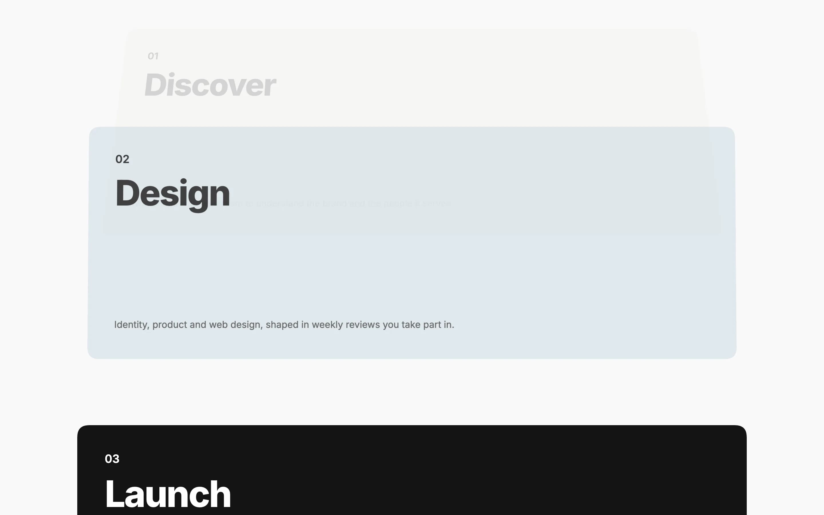
The cards are the row's inner rows
Add an inner row to the row for each card. For the stacking effects, give each one a background and a Minimum Height in its own Layout tab. The front-end editor shows the cards as a plain list instead of stacking them, so they stay easy to edit. For Scrolling strip, cards are as tall as the tallest one, no Minimum Height needed.
Settings
Offhb_stackTurns this row's inner rows into cards. Depth (moves up, tilts back and fades), Scale down, Fade, and Blur stick and stack the cards near the top of the screen as described above. Horizontal: cards slide sideways instead keeps the row itself in view while the cards slide sideways as the page scrolls. Scrolling strip: an endless row of cards drifts sideways repeats the cards in an endless row that drifts sideways as the page scrolls, for example testimonials; use two rows with opposite Direction for a crossing effect.
100hb_stack_topDistance from the top of the screen where the cards stick (or, for Horizontal, where the row itself sticks), in pixels. Default 100, room for a sticky header. Doesn't apply to Scrolling strip.
0hb_stack_stepEach card sticks this many pixels lower than the one before, so the edges of earlier cards stay visible underneath. Default 0. Only applies to the stacking effects (Depth, Scale down, Fade, Blur).
10hb_stack_gapScroll distance between cards, in percent of the screen height. Default 10. Only applies to the stacking effects.
90hb_stack_widthHorizontal only. Each card's width, in percent of the width inside the column's padding. Default 90, so the next card peeks in.
18hb_stack_spaceHorizontal and Scrolling strip. Space between the cards, in pixels. Default 18. Set the space around the strip itself with the column's padding in Design Options.
560hb_stack_cardScrolling strip only. Each card's width, in pixels. Cards are never wider than 80% of the screen. Default 560.
To the lefthb_stack_dirScrolling strip only. Which way the strip drifts: To the left or To the right. Give two rows opposite directions for a crossing effect.
Normalhb_stack_speedScrolling strip only. Slow, Normal, or Fast: how far the strip moves while it crosses the screen.
Yeshb_stack_fadeScrolling strip only. When Yes, the strip fades out at both sides instead of cutting off sharply.
Offhb_stack_dragScrolling strip only. Visitors can also drag the strip sideways with the mouse or a finger. It glides on after they let go, then keeps drifting with the page scroll. See Drag to Scroll.
Offhb_stack_phoneTurn this on to show the cards as a plain list on phones instead of sticking, stacking, or sliding sideways there. Doesn't apply to Scrolling strip.
Drag to Scroll
Turn on Drag to Scroll for a Scrolling strip and visitors can take hold of it and pull it sideways, for example to read the next testimonial without waiting for it to drift by. The pointer turns into a grabbing hand over the strip.
- Mouse and touch. It works with a mouse and with a finger on a touch screen. On a touch screen, a sideways swipe drags the strip while an up or down swipe still scrolls the page, and pinch-zoom still works.
- It glides. After a drag the strip keeps going for a moment and slows to a stop, like a flick. Pressing on it stops it right away.
- It keeps drifting. Once it settles, the strip carries on moving with the page scroll from where the visitor left it.
- It never runs out. The strip loops endlessly in both directions, so it can be dragged as far as the visitor likes.
- Links still work. A click on a link or button inside a card follows it as usual. Only a drag, which starts after the pointer moves a few pixels, moves the strip and doesn't count as a click.
Browser support
The sticking and stacking itself works in any modern browser, and so do the horizontal and scrolling strips. The sliding, drifting, and the animation between stacked cards all need CSS scroll-driven animations. Without that support, stacked cards still stick and stack (just without the animated transition), and horizontal cards and the scrolling strip both show as a strip you can scroll sideways instead of animating on their own. Visitors who prefer reduced motion see the same fallback: stacked cards stick and stack without the animation, and horizontal cards and the scrolling strip show as a swipeable, scrollable strip. With Drag to Scroll on, visitors who prefer reduced motion can still drag the sideways scroll with a mouse, without the glide. Touch screens and trackpads scroll it as they do any strip. The front-end editor also shows horizontal cards and the scrolling strip as a strip you can scroll sideways, so they stay easy to edit. For the scrolling strip, the cards it repeats to fill the strip are hidden from screen readers.
Build a horizontal card section
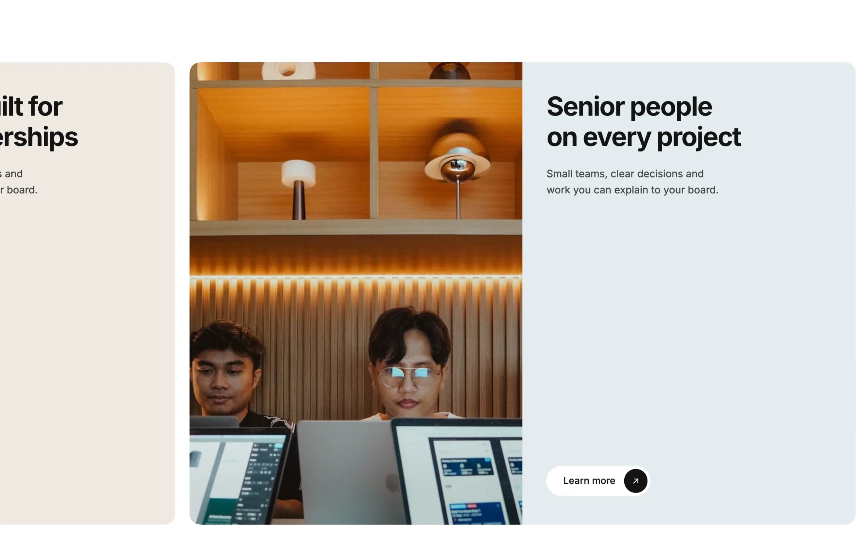
A row of cards that slides sideways while the row stays pinned in view, each card an image next to text with a button at the bottom.
- Edit the row and, on its General tab, set Row stretch to Stretch row and content (no paddings).
- On the Stacked Cards tab, set Stacked Cards to Horizontal and set Sticky Top to match your sticky header height.
- On the row's column, add padding in Design Options: that padding becomes the space around the card strip.
- Add an inner row for each card. Give each inner row two columns: one for a background image, one for text. Give each inner row a Border Radius in Design Options so the cards have rounded corners.
- On the text column, open its Layout tab and set Content Direction to Stack vertically and Distribute Content to Start, last element at the end, so any button in that column sits at the bottom of the card no matter how much text is above it.
Build a scrolling testimonial wall

Two stretched rows of cards drifting past each other in opposite directions, each card a short testimonial with a name and photo.
- Add two rows. On each one's General tab, set Row stretch to Stretch row and content (no paddings).
- On the first row's Stacked Cards tab, set Stacked Cards to Scrolling strip: an endless row of cards drifts sideways. Do the same on the second row, but set its Direction to To the right, so the two strips cross.
- On each row, set row spacing with Design Options, for example 18px bottom padding and no margin. On the row's column, set the top padding to 0.
- Add an inner row for each testimonial. On its column, set a background color, padding, and a border radius in Design Options, then on the column's Layout tab set Content Direction to Stack vertically and Distribute Content to Start, last element at the end.
- Inside each card, add a Custom Heading for the title, a Custom Heading (tag
p) for the quote, and a Circle Images element with one photo, its Title set to the person's name and Text set to a short line such as "Member since Jan 2026".
Related
Layout tab
Flexbox layout controls for rows, columns and inner rows: content direction, alignment, gaps, minimum height, sticky columns, and corner shapes.
Floating Images
Small images scattered around a row's content that drift away from the mouse, sit at different depths, and float gently as the page scrolls.