Header
Build your header from a top bar, one of four main layouts, side navigation, and a navigation skin with its own animation.
Header Layout is the second sub-tab under Layout Settings. Its four sections combine to produce most of Highend's header variations: an optional top bar, the main header layout, side navigation, and the main navigation's look.
Where to find it: Go to HighendHighend OptionsLayout SettingsHeader Layout.
Onhb_top_header_barShows a thin bar above the main header with contact info on the left and icons/buttons on the right. Turning it off hides the Top Header Settings section below.
Top Header Settings
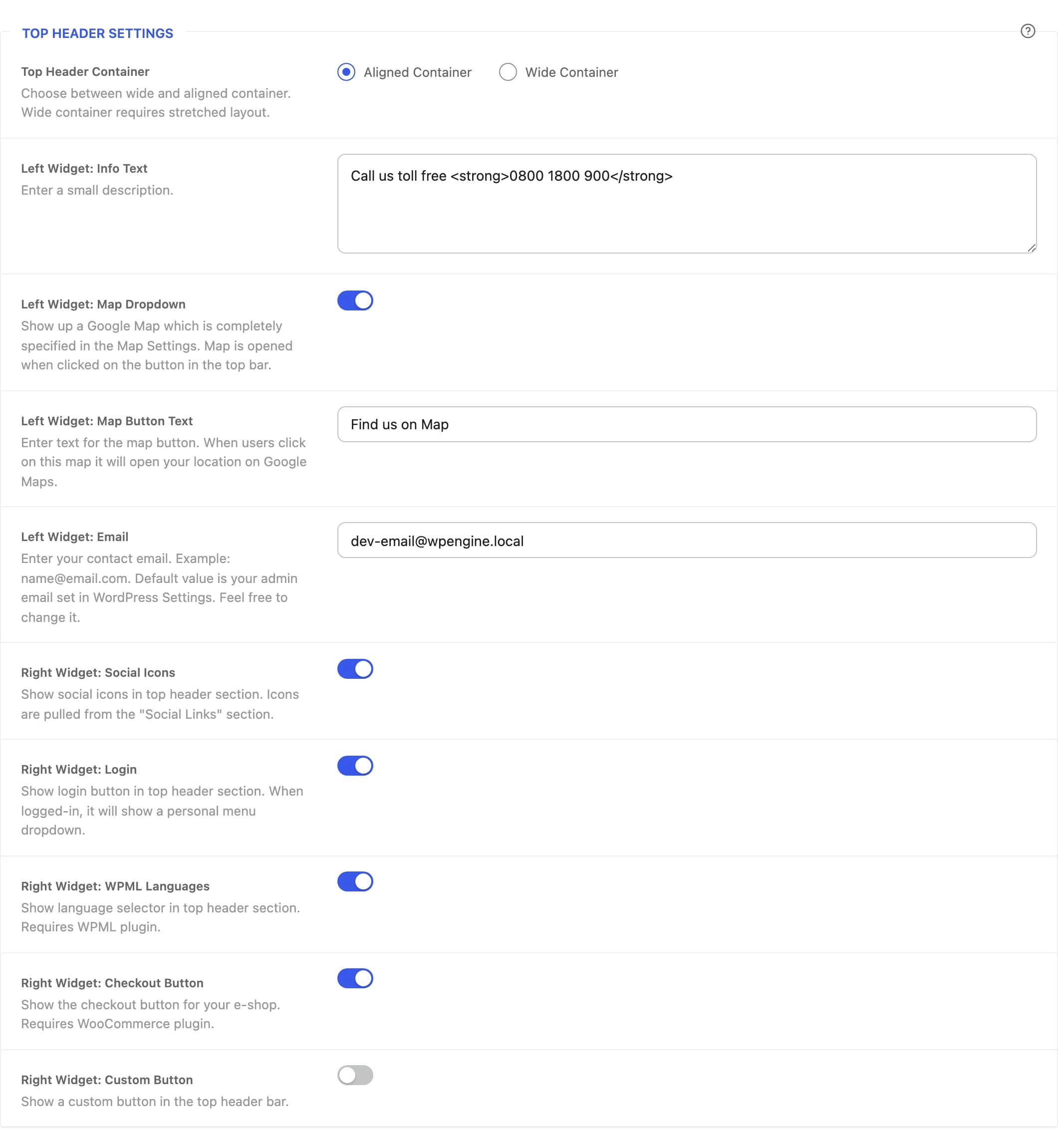
Aligned Containerhb_top_header_containerWide Container stretches the top bar edge-to-edge and requires a Stretched global layout.
Call us toll free <strong>0800 1800 900</strong>hb_top_header_info_textA short line of text (HTML allowed) shown on the left side of the bar. Leave empty to hide it.
Onhb_top_header_mapAdds a button that opens a fullwidth map dropdown showing the locations set in Map Settings.
Find us on Maphb_top_header_map_textLabel for the map dropdown button.
hb_top_header_emailContact email shown on the left side. Defaults to your WordPress admin email.
Onhb_top_header_socials_enableShows social icons pulled from Social Links.
Onhb_top_header_loginShows a login link that becomes a personal menu dropdown once a visitor is logged in.
Onhb_top_header_languagesShows a language switcher. Requires the WPML plugin.
Onhb_top_header_checkoutShows a checkout/cart button. Requires WooCommerce.
Offhb_top_header_linkShows a custom button with its own icon, title, and link. The three fields below appear once this is on.
hb_top_header_link_iconIcon shown on the custom button.
Enter your text here...hb_top_header_link_txtLabel for the custom button.
https://hb-themes.comhb_top_header_link_linkURL the custom button links to.
Header Layout
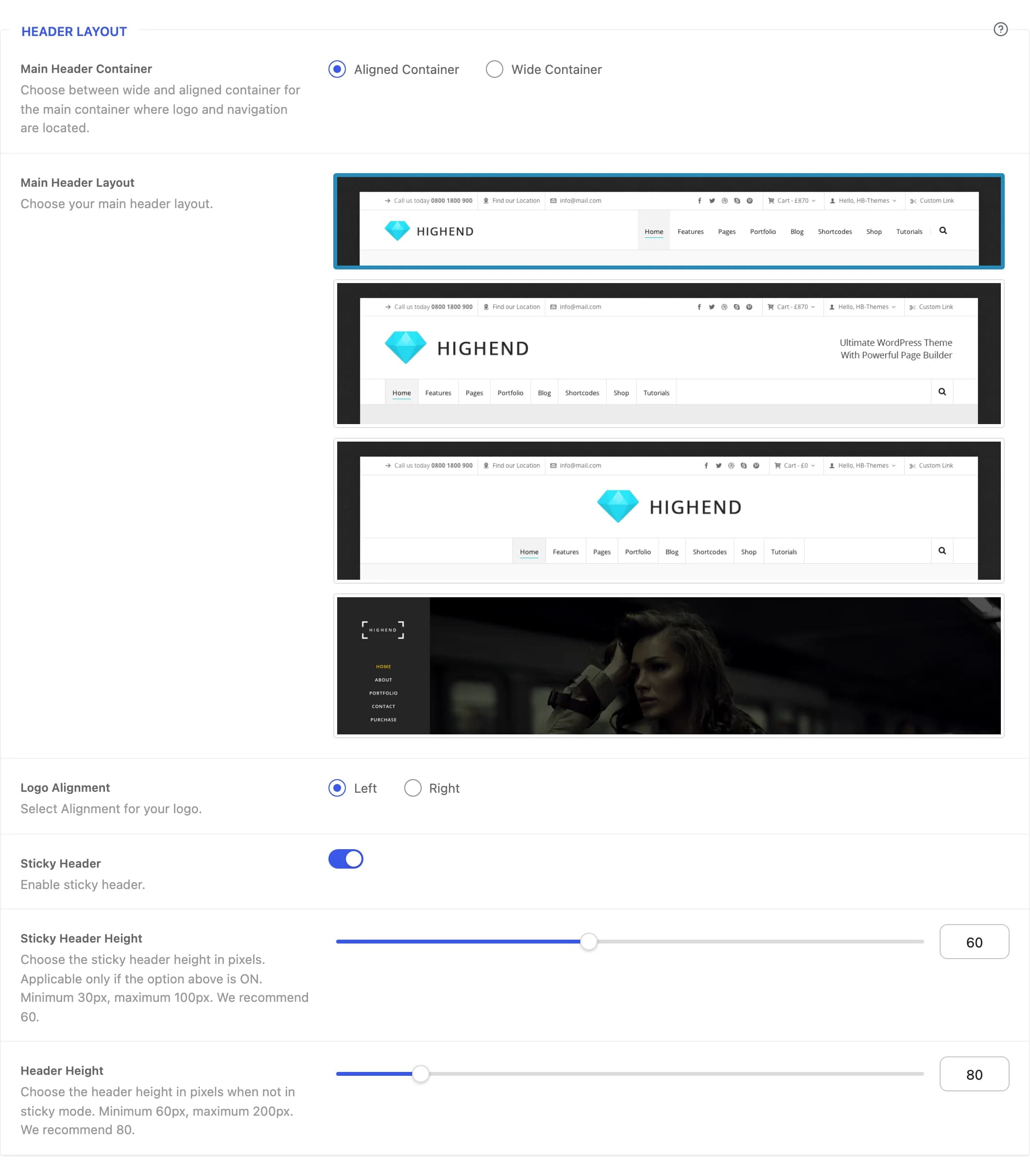
Aligned Containerhb_main_header_containerWide Container stretches the row holding your logo and navigation edge-to-edge.
Type 1hb_header_layout_styleHighend's four base header layouts: Type 1 (logo left, navigation right, same row), Type 2 (logo and an optional text box on their own row above the navigation), Type 3 (Type 2 with a centered navigation row), and Side Navigation (a fixed vertical panel instead of a horizontal header; see below).
Lefthb_logo_alignmentAligns the logo to the left or right of the header. Not shown for Type 3 or Side Navigation, which center the logo.
On for Type 1, Off for Type 2/3hb_sticky_header / hb_sticky_header_altKeeps the header pinned to the top of the viewport while scrolling. Not shown for Side Navigation.
60hb_sticky_header_heightHeader height in pixels while sticky, from 30 to 100. Shown only for Type 1.
80hb_regular_header_heightHeader height in pixels when not sticky, from 60 to 200. Shown only for Type 1.
Ultimate WordPress Theme<br/>With Powerful Page Builderhb_header_right_textHTML text shown to the right of the logo. Shown only for Type 2.
Side Panel Navigation Options
This section only appears when Main Header Layout is set to Side Navigation, a fixed vertical panel that replaces the horizontal header entirely.
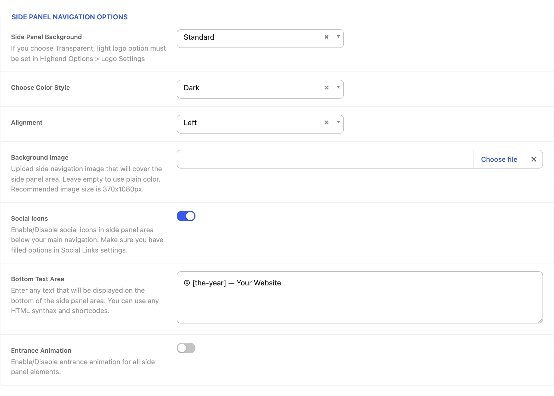
Standardhb_side_nav_styleTransparent (standard on scroll) starts see-through over your page content and becomes solid once the visitor scrolls. If you use it, set a light logo in Logo Settings.
Darkhb_side_color_styleLight or dark color scheme for the panel and its text.
Lefthb_side_nav_alignSide of the screen the panel docks to, or Center to center its content within the panel.
hb_side_nav_bgCovers the whole panel. Recommended size 370×1080px. Leave empty to use a plain color instead.
Onhb_side_nav_enable_socialsShows social icons below the navigation, pulled from Social Links.
© [the-year] — Your Websitehb_side_nav_bottom_textHTML text (shortcodes allowed) shown at the bottom of the panel.
Offhb_side_nav_with_animationAnimates the panel's elements in on page load.
Navigation Layout
This section appears for Types 1–3 (it's replaced by Side Panel Navigation Options for Side Navigation).
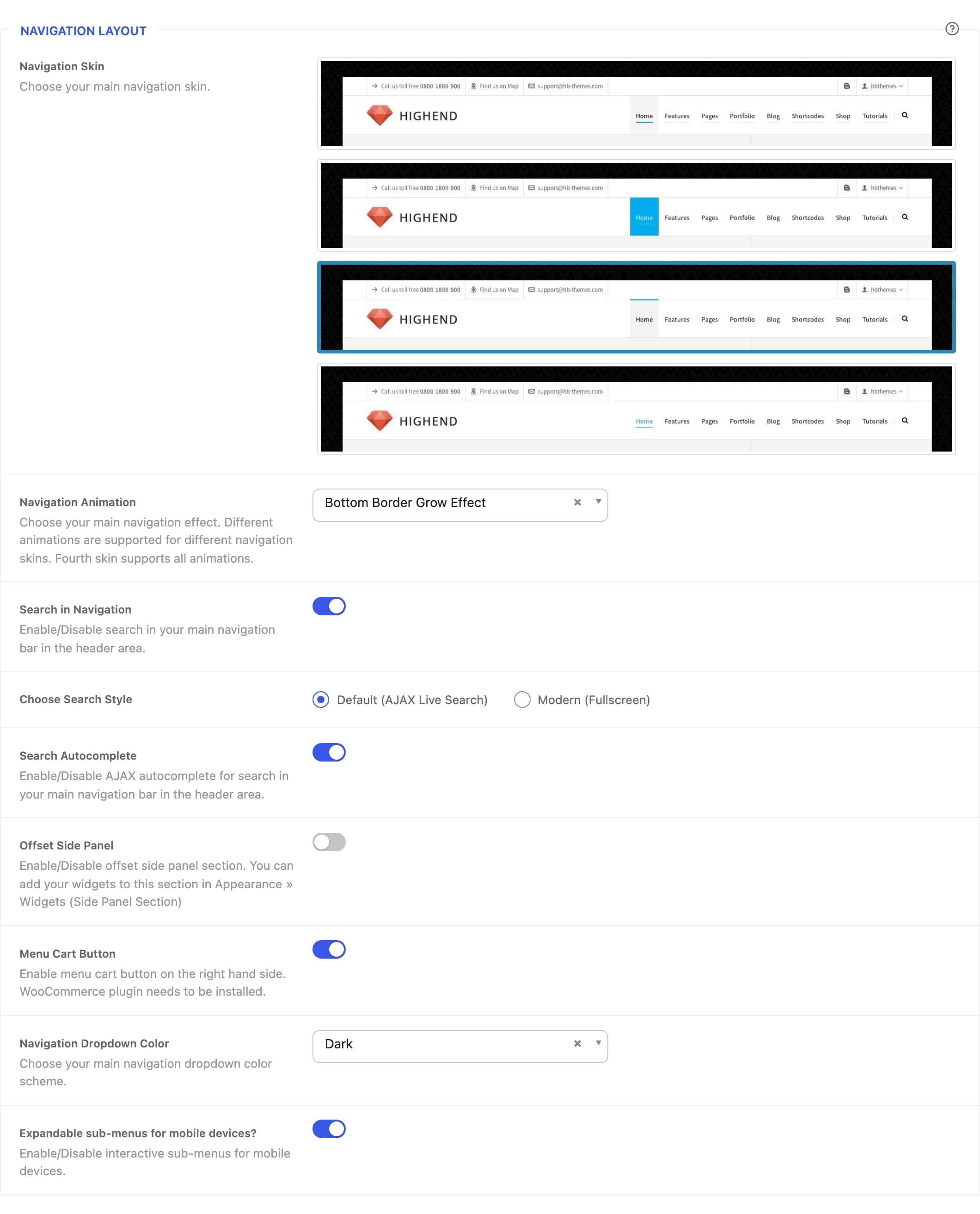
Thirdhb_header_layout_skinThe main navigation's visual style. Which Navigation Animation effects are available depends on this choice. The fourth skin supports the most.
Bottom Border Grow Effecthb_navigation_animationHover effect on top-level menu items. Options change based on the selected Navigation Skin.
Onhb_search_in_menuShows a search icon in the navigation bar.
Default (AJAX Live Search)hb_search_styleDefault opens a search field in the header with live results as you type. Modern (Search window) opens a search window instead: a rounded card near the top of the screen, over a dimmed and blurred page, in the navigation colors. It shows live results with a thumbnail, the type and the date (arrow keys to pick one, Enter to open it), and closes with Escape or a click outside.
Onhb_ajax_searchShows live results while typing, in both search styles.
Offhb_side_sectionAdds a slide-out panel triggered from the navigation. Add widgets to it under AppearanceWidgets in the Side Panel Section area.
Onhb_enable_sticky_shop_buttonShows a cart icon/button in the navigation. Requires WooCommerce.
Darkhb_main_navigation_colorColor scheme for sub-menu dropdowns.
Onhb_interactive_mobile_dropdownOn mobile, lets a visitor tap a parent menu item to expand its sub-menu in place instead of navigating away immediately.
Classic: three lineshb_mobile_menu_styleThe button that opens the menu on phones and tablets, and the look of the menu itself. Options: Classic: three lines (three thin lines, the lower one shorter, with no animation), Modern: two lines (two thin lines that swap lengths on hover), Label and lines (the word "Menu", in the navigation font, before the two modern lines). Modern and Label and lines also give the menu itself a fresh look, see below.
Mobile menu look
Classic keeps the mobile menu panel as it always was. With Modern or Label and lines, the menu becomes a floating rounded panel in your header's navigation colors, over a dimmed page. It shows your logo and the close button on top, then the search field (when Search in Navigation is on) and the menu items, which rise in one after another in large type without borders. The sub-menu toggles are restyled to match.
With every style, the menu button tells screen readers whether the menu is open, and pressing Escape closes the menu and returns to the button.