Page settings
The Highend Settings box on the page editor: per-page title, layout, header, footer, featured section, background and advanced settings.
Every page has a Highend Settings box below the content editor. Its tabs override sitewide Highend Options for that one page only.
Where to find it: Go to PagesAdd New or open any page for editing, then scroll below the content to the Highend Settings box.
 Title, Layout, Header, Footer, Featured Section, Background and Advanced tabs.
How the tabs work
The box groups the page's settings into seven tabs: Title, Layout, Header, Footer, Featured Section, Background and Advanced. Click a tab to see its settings. The box opens on the tab you used last.
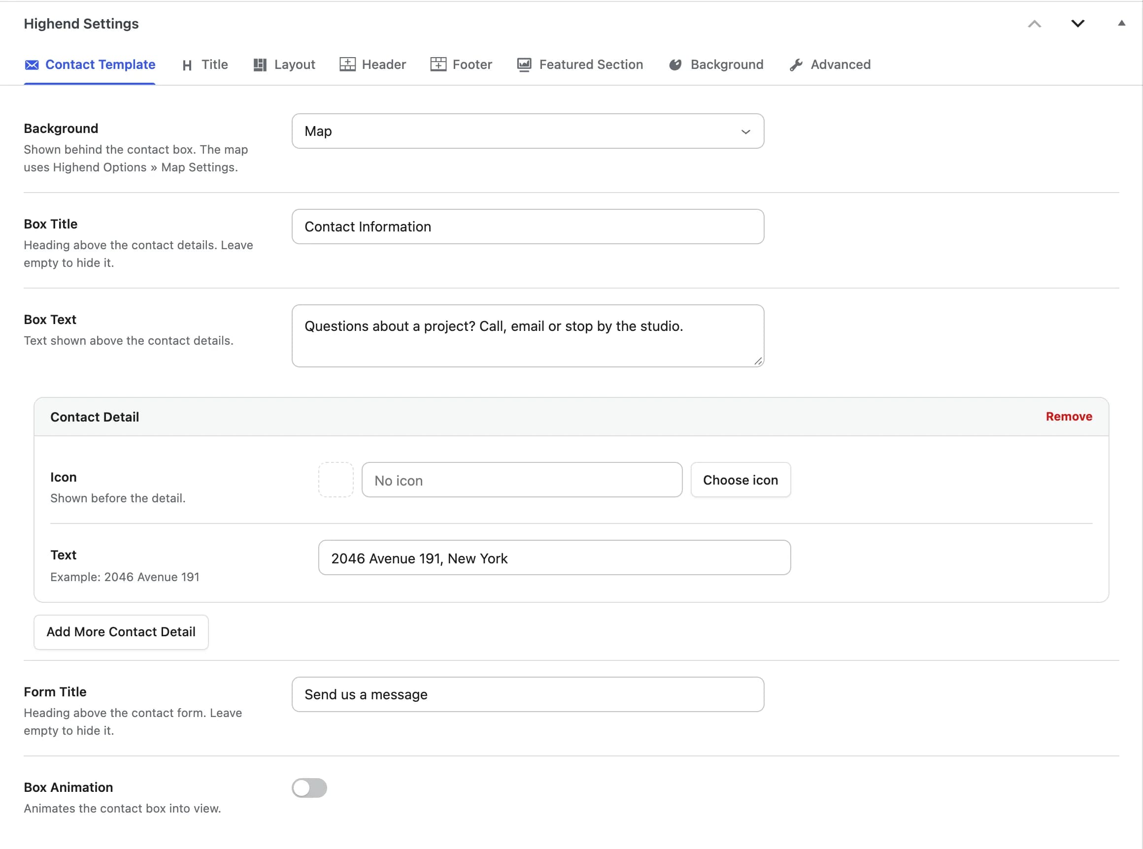
When you choose a page template that has its own settings, such as Contact Template or Blog - Classic, a tab for it appears first in the box and opens right away. Switch back to the default template and the tab goes away. See Page template tabs.
All tabs save together when you save or update the page.
The General Settings, Layout Settings, Misc Settings, Background Settings and Featured Section Settings boxes are now tabs of the Highend Settings box, and the fields have shorter names. Your saved values carry over. See Where the old fields went.
How overrides work
Most fields default to Use Highend Options Settings, which means the page inherits the sitewide value. Pick a specific value instead (like Show, Hide, or a color) to override it for this page only. Leave a field on the default and it follows your Highend Options automatically. Set it explicitly and this page's value wins from then on, even after you change the sitewide setting.
Other post types
Posts, team members, portfolio items and FAQ items get the same Highend Settings box, with the tabs that apply to them:
| Post type | Tabs |
|---|---|
| Pages | Page template tab (when a template is chosen), Title, Layout, Header, Footer, Featured Section, Background, Advanced |
| Posts | Post Format (Video, Audio, Link and Quote formats), Title, Layout, Header, Footer, Background, Advanced |
| Team members | Team Member, Title, Layout, Header, Footer, Featured Section, Background, Advanced |
| Portfolio items | Portfolio Page, Title, Layout, Header, Footer, Background, Advanced |
| FAQ items | Title, Layout, Header, Footer, Background, Advanced |
Sidebar Layout, Sidebar, Content Area, Top Bar, Footer Widgets and Pre-Footer Callout are on pages and posts only. Team members and portfolio items have their own layout fields at the top of the Layout tab instead.
Testimonials, pricing tables, clients and gallery items have a single settings box of their own, without tabs.
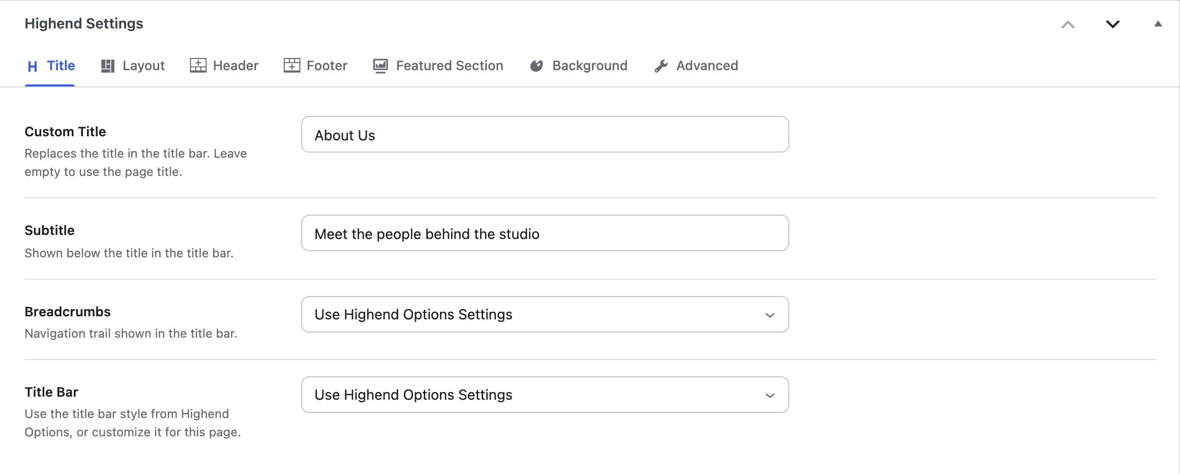
Title
The title bar above the content: its text, breadcrumbs and style.
hb_page_title_h1Replaces the title in the title bar. Leave empty to use the page title.
hb_page_subtitleShown below the title in the title bar.
Use Highend Options Settingshb_breadcrumbsThe navigation trail shown in the title bar. Options: Use Highend Options Settings, Show, Hide.
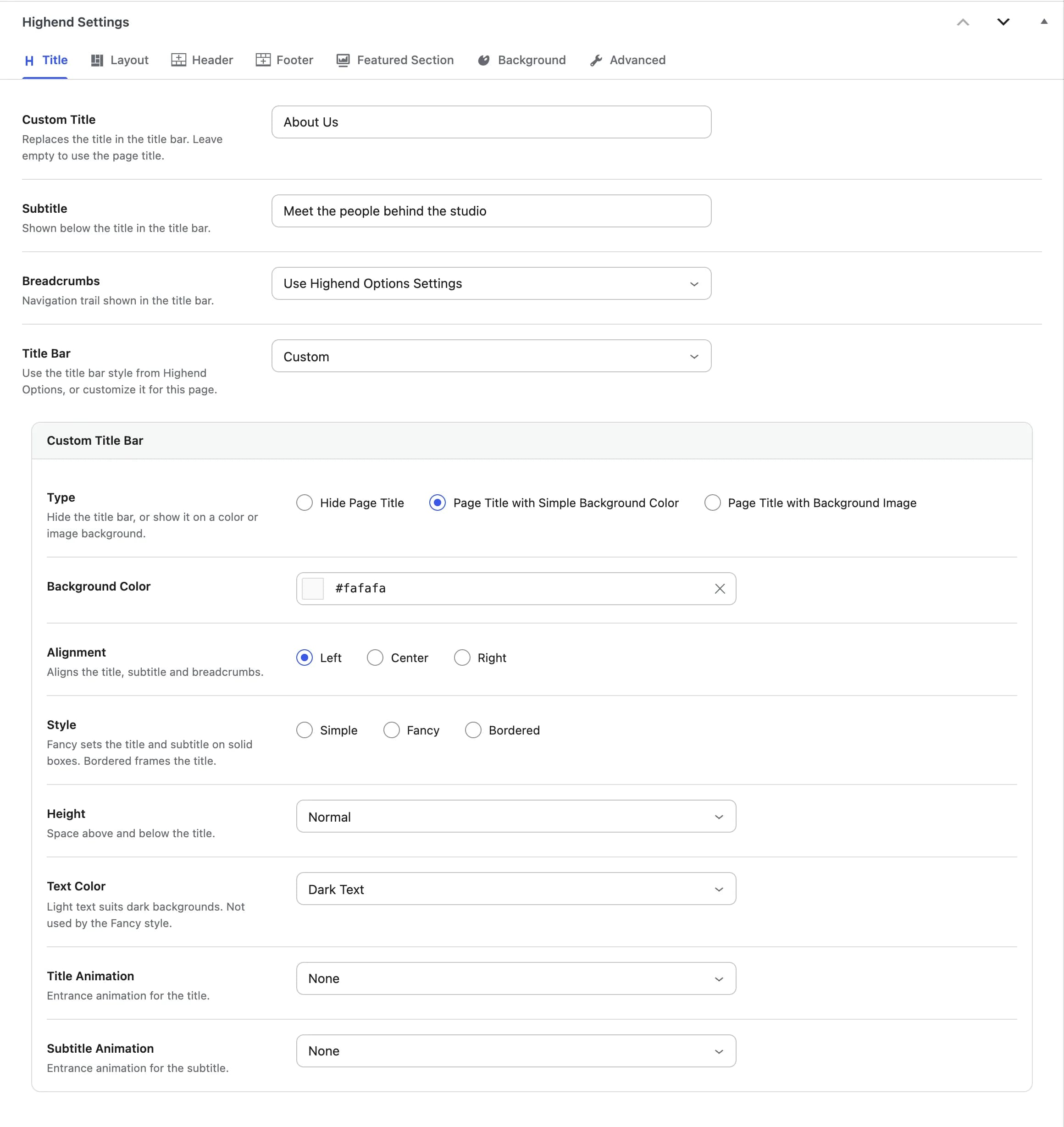
Use Highend Options Settingshb_page_title_optionSet to Custom to show the Custom Title Bar fields below and style the title bar for this page only.
When Title Bar is set to Custom, each of these fields starts out with your current Highend Options value, so only the fields you change affect this page:
hb_page_title_typeHide Page Title, Page Title with Simple Background Color, or Page Title with Background Image.
hb_page_title_background_colorShown when Type is Page Title with Simple Background Color.
hb_page_title_background_imageReplaces the title bar image set in Highend Options. Shown when Type is Page Title with Background Image.
hb_page_title_background_image_parallaxAdds a parallax scroll effect to the background image. Shown when Type is Page Title with Background Image.
hb_page_title_alignmentAligns the title, subtitle and breadcrumbs: Left, Center, or Right.
hb_page_title_styleSimple, Fancy (the title and subtitle sit on solid boxes), or Bordered (a frame around the title).
hb_page_title_heightSpace above and below the title: Extra Large, Large, Normal, or Small.
hb_page_title_colorLight Text (for dark backgrounds) or Dark Text. Not used by the Fancy style.
hb_page_title_animationEntrance animation for the title. Hidden when Type is Hide Page Title.
hb_page_title_subtitle_animationEntrance animation for the subtitle. Hidden when Type is Hide Page Title.
Layout
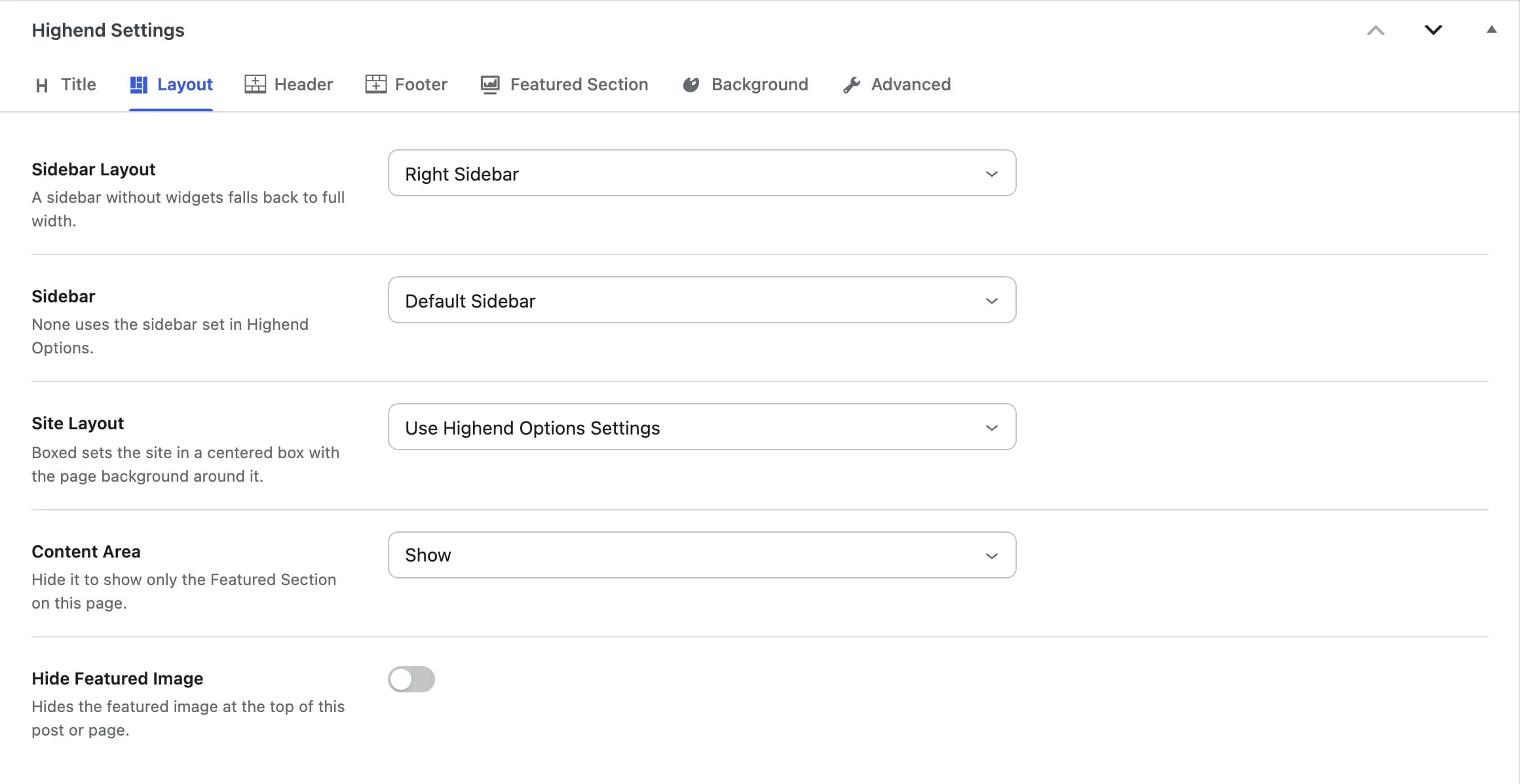
The page's sidebar, site width and content area.
Use Highend Options Settingshb_page_layout_sidebarFullwidth, Right Sidebar, or Left Sidebar. A sidebar layout falls back to full width when the sidebar has no widgets, so the page never shows an empty column.
Nonehb_choose_sidebarWhich sidebar to show. Shown when Sidebar Layout is Right Sidebar or Left Sidebar. Lists Default Sidebar plus the custom sidebars you created. None uses the sidebar set in Highend Options.
Use Highend Options Settingshb_boxed_stretched_pageBoxed sets the site in a centered box with the page background around it. Stretched fills the browser width. See General Layout.
Showhb_content_areaSet to Hide to show only the Featured Section on this page.
Offhb_hide_featured_imageHides the featured image at the top of a post or FAQ item. On a page or team member, it hides the image of a Featured Section set to Featured Image at its original size.
Header
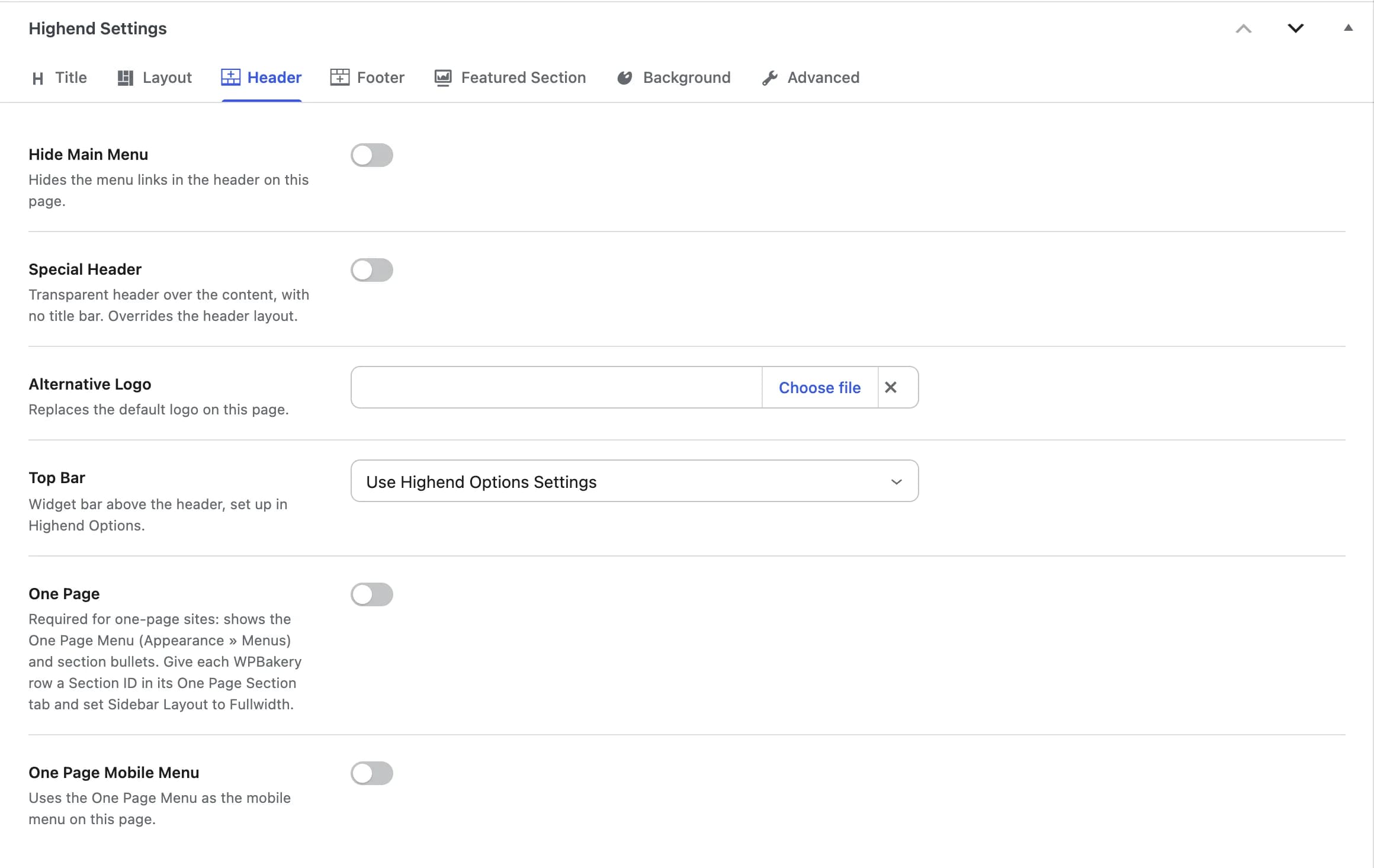
The menu, logo, top bar and one-page features for this page.
Offhb_disable_navigationHides the menu links in the header on this page. On a one-page site it also hides the section bullets.
Offhb_special_header_styleA transparent header over the content, with no title bar. The page uses this header whatever header layout Highend Options sets.
hb_page_alternative_logoReplaces the default logo on this page.
Use Highend Options Settingshb_header_widgetsShows or hides the widget bar above the header. Its content is set up in Header Layout. Options: Use Highend Options Settings, Show Widgets, Hide Widgets.
Offhb_onepageRequired for a one-page site. Swaps the main menu for the One Page Menu (assigned in Appearance > Menus) and adds section bullets. Give each WPBakery row a Section ID in its One Page Section tab, and set Sidebar Layout to Fullwidth in the Layout tab.
Offhb_onepage_alsoUses the One Page Menu as the mobile menu on this page.
Footer
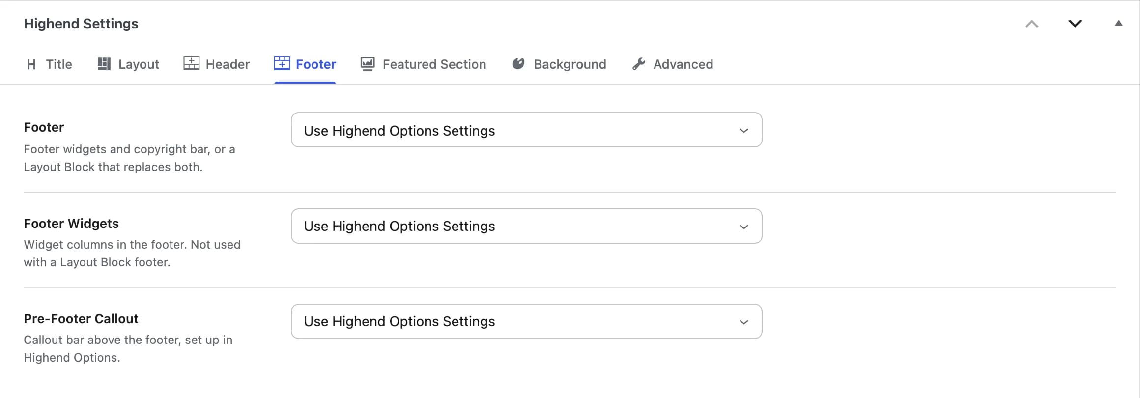
Use Highend Options Settingshb_footer_blockFooter widgets and copyright, or any published Layout Block, which replaces both.
Use Highend Options Settingshb_footer_widgetsShows or hides the widget columns in the footer. Not used when the footer is a Layout Block.
Use Highend Options Settingshb_pre_footer_calloutShows or hides the callout bar above the footer. Its content is set up in Pre-Footer Callout.
Featured Section
Only on pages and team members. Adds a full-width area between the title bar and the content: an image, a video, or a slider.
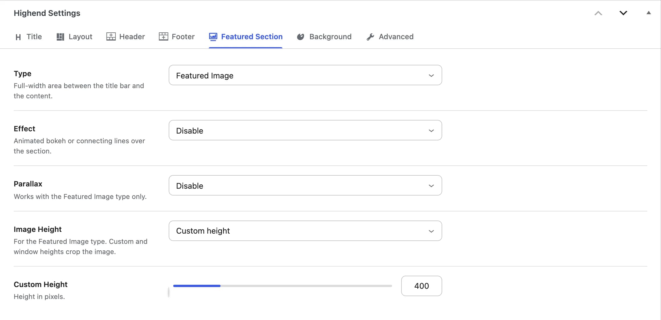
Hidehb_featured_section_optionsHide, Featured Image, Video, Revolution Slider (listed once you've built a slider in Slider Revolution), or Layer Slider (listed once you've built a slider in LayerSlider). See Sliders.
hb_rev_sliderWhich slider to show. Shown when Type is Revolution Slider.
hb_layer_sliderWhich slider to show. Shown when Type is Layer Slider.
hb_page_videoA YouTube or Vimeo link, such as https://www.youtube.com/watch?v=Q_7cVyM8Efg. Shown when Type is Video.
Disablehb_featured_section_effectAnimated Bokeh Effect or Connecting Lines Effect over the section.
Disablehb_featured_section_parallaxParallax scrolling for the image. Works with the Featured Image type only.
Original size - do not crophb_featured_section_heightOriginal size - do not crop, Custom height, or Window height. For the Featured Image type. Custom and window heights crop the image.
400hb_featured_image_heightHeight in pixels, from 70 to 1600. Shown when Image Height is Custom height.
Background
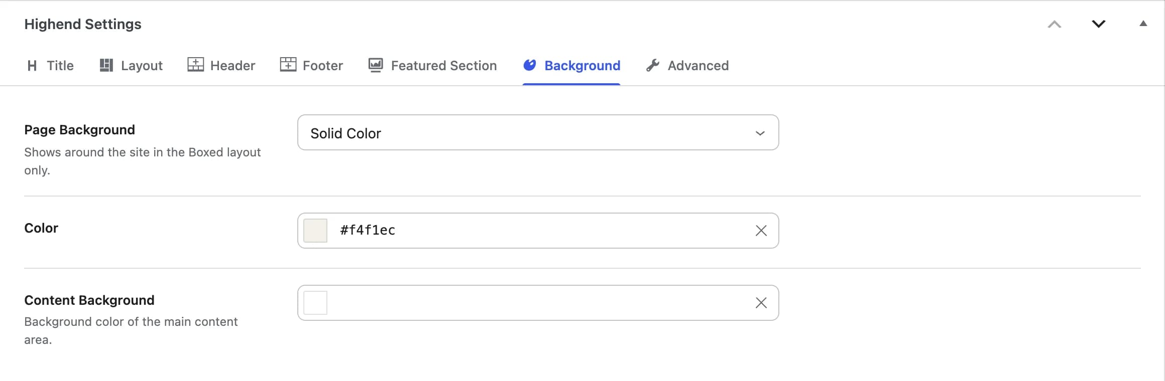
Use Highend Options Settingshb_background_page_settingsImage or Solid Color behind the site. It only shows with the Boxed site layout, around the centered box.
hb_page_background_colorShown when Page Background is Solid Color.
hb_page_background_imageShown when Page Background is Image. Repeat, position and scrolling follow the Boxed Layout Settings in Highend Options.
hb_content_background_colorBackground color of the main content area. Works with any site layout.
Advanced
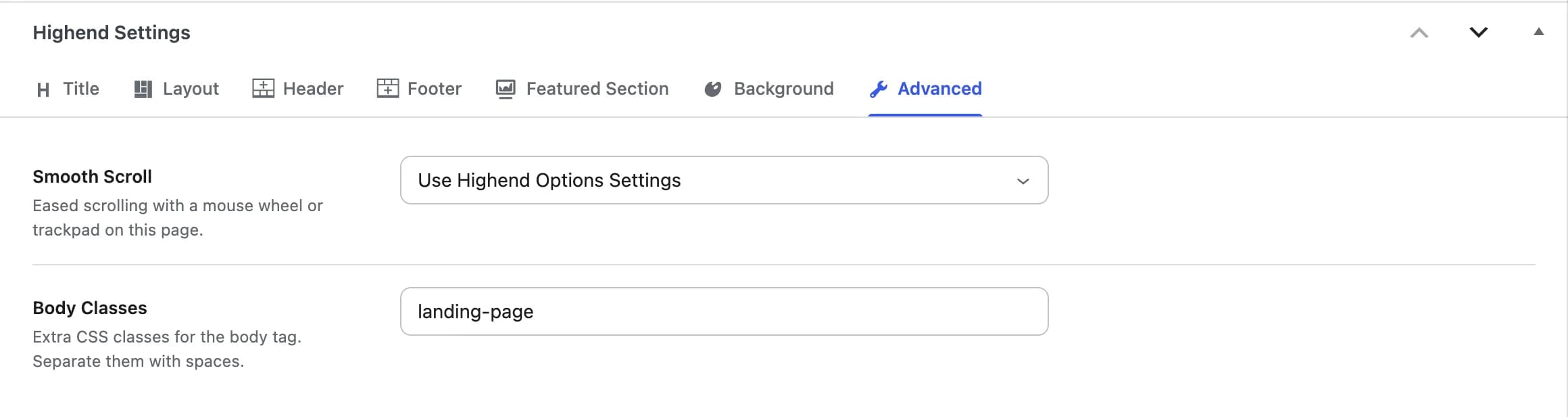
Use Highend Options Settingshb_smooth_scrollEased scrolling with a mouse wheel or trackpad on this page. Options: Use Highend Options Settings, On, Off.
hb_page_extra_classExtra CSS classes for the page's <body> tag, separated by spaces. Useful for CSS that targets one page.
Page template tabs
Some page templates add a tab of their own, listed first in the box: Contact Template, Classic Blog Template, Grid Blog Template, Fullwidth Blog Template, Minimal Blog Template, Portfolio Template, Standard Gallery Template, Fullwidth Gallery Template and Presentation. The tab appears and opens when you choose its template in the editor's Template setting. The fields of each one are described on Page templates.
Where the old fields went
| Old box | Field (old name) | Now in |
|---|---|---|
| General Settings | Title, Subtitle, Breadcrumbs, Page Title Advanced Settings | Title tab: Custom Title, Subtitle, Breadcrumbs, Title Bar |
| General Settings | Hide Featured Image | Layout tab |
| General Settings | Footer | Footer tab |
| General Settings | Smooth Scroll | Advanced tab |
| Layout Settings (sidebar) | Page Layout, Sidebars, Content Area | Layout tab: Sidebar Layout, Sidebar, Content Area |
| Layout Settings (sidebar) | Header Widgets | Header tab: Top Bar |
| Layout Settings (sidebar) | Footer Widgets, Footer Callout Area | Footer tab: Footer Widgets, Pre-Footer Callout |
| Misc Settings | Boxed or Stretched Layout | Layout tab: Site Layout |
| Misc Settings | Disable Main Navigation Menu, Enable Special Header Style, Alternative Logo | Header tab: Hide Main Menu, Special Header, Alternative Logo |
| Misc Settings | Enable One Page Elements, Use One Page menu for Mobile Menu? | Header tab: One Page, One Page Mobile Menu |
| Misc Settings | Extra Classes | Advanced tab: Body Classes |
| Featured Section Settings | Featured Section Type, Featured Section Effect, Featured Image Height | Featured Section tab: Type, Effect, Image Height |
| Background Settings | Background Settings, Solid Color, Background Image, Content Background Color | Background tab: Page Background, Color, Image, Content Background |