Process Steps
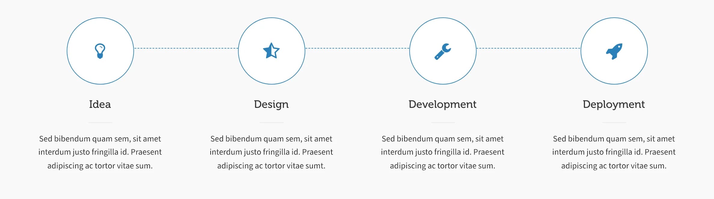
A horizontal, numbered-style timeline of icon circles connected by a dotted line, ideal for explaining a workflow.
Process Steps lays out a row of icon circles connected by a dotted line, each with a title and text, useful for walking visitors through a process like "Idea → Design → Development → Launch."
Add it
Process Steps has no WPBakery element; it isn't in the Add Element panel. Add it as a shortcode instead: in the block editor use a Shortcode or Custom HTML block, or if you're editing with WPBakery Page Builder, add it inside a Text Block element.
Settings
Process Steps has no visual settings panel; configure it entirely through shortcode attributes. See Shortcode below.
Common settings
Like most Highend elements, Process Steps and each Process Step also accept animation, animation_delay, and class attributes. See the Elements overview.
Shortcode
[process_steps] is the wrapper; each step inside it is a [process_step].
[process_steps]
[process_step title="Idea" icon="hb-moon-idea"]Sed bibendum quam sem, sit amet interdum justo fringilla id.[/process_step]
[process_step title="Design" icon="hb-moon-star"]Praesent adipiscing ac tortor vitae sum.[/process_step]
[process_step title="Development" icon="hb-moon-wrench"]Sed bibendum quam sem, sit amet interdum justo fringilla id.[/process_step]
[process_step title="Deployment" icon="hb-moon-rocket"]Praesent adipiscing ac tortor vitae sum.[/process_step]
[/process_steps]
Prop
Type
The step's paragraph text is the content between [process_step] and [/process_step], not an attribute. The theme's CSS only has fitted widths for 3, 4, or 5 steps; stick to that range, or add your own CSS for other counts.