Circle Chart
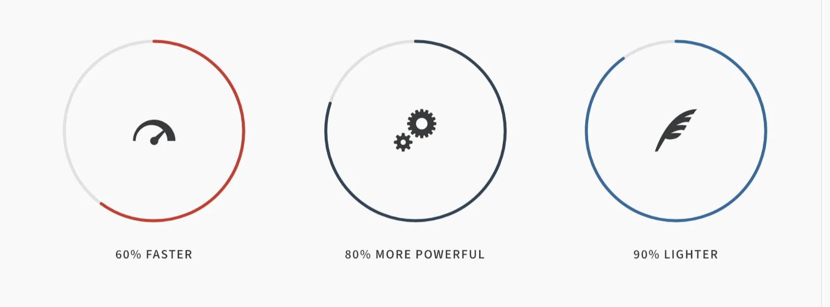
An animated circular progress chart showing an icon, a percentage, or custom text, with an optional caption.
Circle Chart draws an animated ring that fills to a percentage when it scrolls into the visitor's viewport, with an icon, the percentage itself, or custom text in the middle.
Add it
In WPBakery, click Add Element and pick Circle Chart from the Highend Shortcodes category. Or use the shortcode (see Shortcode).
Settings
Chart with IcontypeWhat's shown in the center of the ring. Options: Chart with Icon, Chart with Percent, Chart with Text.
60percentHow far the ring fills, 0–100. Do not include a % character.
iconShown when Chart Type is Chart with Icon. See the icon list. Leave empty and Highend falls back to a hb-moon-brain icon.
textCustom text shown when Chart Type is Chart with Text.
captionOptional caption shown below the chart.
#336699colorColor of the filled part of the ring. The field is blank in WPBakery; leaving it empty falls back to #336699.
#e1e1e1track_colorColor of the unfilled part of the ring. The field is blank in WPBakery; leaving it empty falls back to #e1e1e1.
220sizeDiameter of the chart, in pixels.
3weightThickness of the ring, in pixels.
1000animation_speedHow long the fill animation takes, in milliseconds.
Common settings
Circle Chart also has Entrance Animation, Entrance Delay, and Extra class name fields (see the Elements overview).
Shortcode
[circle_chart type="with-icon" color="#c0392b" track_color="#e1e1e1" weight="3" icon="hb-moon-meter-fast" percent="60" caption="60% Faster" animation_speed="300"]