Icon Feature
A centered feature block with a circular icon (or custom image), an optional ring border, and a title and text.
Icon Feature centers an icon (or a custom image) above or beside a title and text, optionally inside a circular border that highlights on hover. It reads as more "designed" than Icon Box, and works well for highlighting a small number of key features.
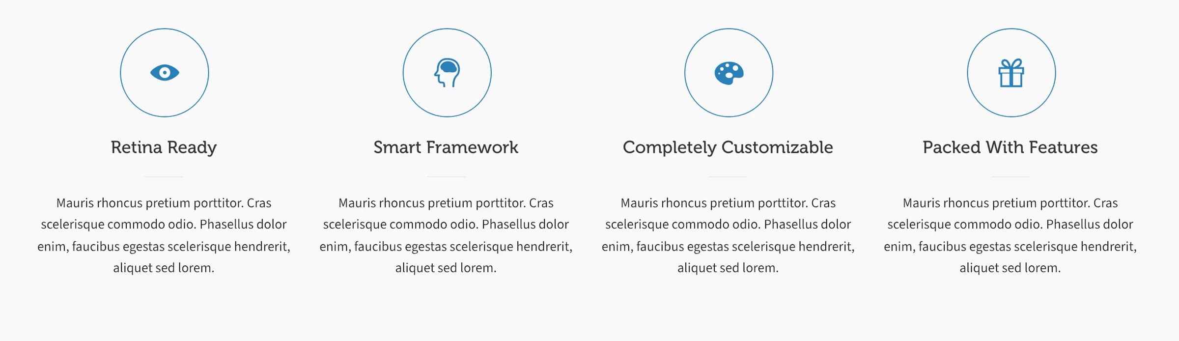
Add it
In WPBakery, click Add Element and pick Icon Feature from the Highend Shortcodes category. Or use the shortcode (see Shortcode).
Settings
iconAn icon name (see the icon list) or a single character. Ignored if Custom Image is set.
linkMakes the icon and title a link. Leave empty for plain text.
Yesnew_tabOptions: Yes, No.
Centericon_positionWhere the icon sits relative to the title and text. Options: Center, Left, Right.
YesborderShows a circular border around the icon with a hover effect. Options: Yes, No.
titleThe feature's heading.
contentThe paragraph text, entered between the shortcode tags rather than in a field.
imageAn uploaded image to use instead of an icon font glyph: Highend suggests 64×64 pixels. Replaces Icon or Character entirely when set.
Common settings
Icon Feature also has Entrance Animation, Entrance Delay, and Extra class name fields (see the Elements overview).
Shortcode
[icon_feature icon="hb-moon-eye-2" icon_position="center" border="yes" title="Retina Ready"]Every graphic looks crisp on high-resolution screens.[/icon_feature]The paragraph text is the content between [icon_feature] and [/icon_feature]: it maps to the Box Content field, not an attribute.