Teaser Box
An image with a title, text, and optional button underneath, for service teasers, feature callouts, or linking to other pages.
Teaser Box pairs an image with a title, a short paragraph, and an optional button beneath it. It's a common building block for "our services" or "what we offer" sections.
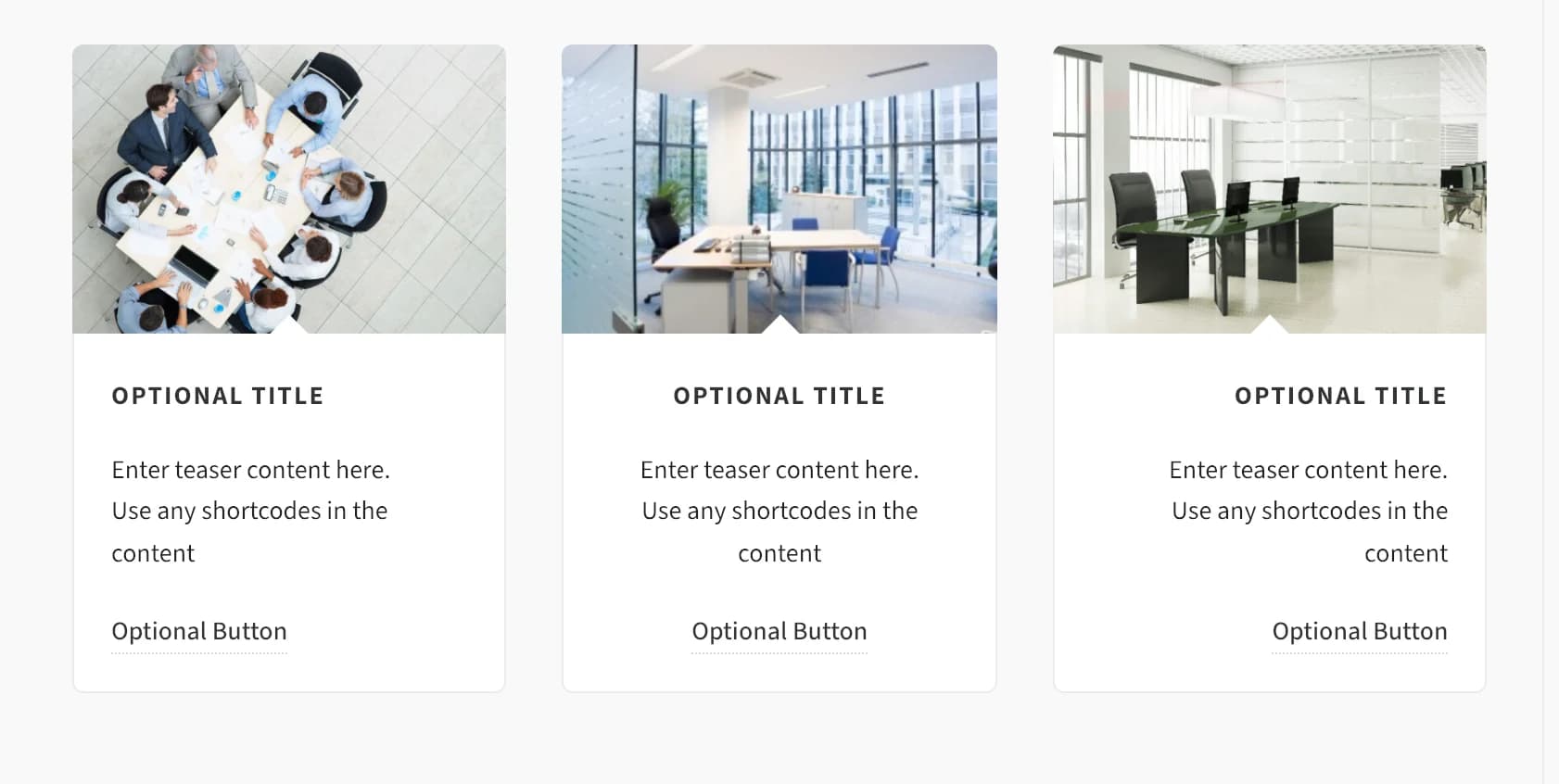
Add it
In WPBakery, click Add Element and pick Teaser Box from the Highend Shortcodes category. Or use the shortcode. See Shortcode.
Settings
imageThe image shown above the title. Leave empty to hide the image section entirely.
LeftalignAligns the title, text, and button. Options: Left, Center, Right.
BoxedstyleOptions: Boxed (bordered card) or Unboxed (no border or background).
titleThe heading shown below the image.
contentThe paragraph text, entered between the shortcode tags rather than in a field.
button_titleCaption for the button. Leave empty to hide the button.
button_linkWhere the button (and the image and title, if a link is set) point to.
Offnew_tabApplies to the title, image, and button links.
Common settings
Teaser Box also has Entrance Animation, Entrance Delay, and Extra class name fields. See the Elements overview.
Shortcode
[teaser image="820" align="alignleft" title="Who we employ" button_title="Read more" button_link="#"]We hire people who care about the details.[/teaser]The paragraph text is the content between [teaser] and [/teaser]; it maps to the Teaser Content field, not an attribute. Content Alignment takes the raw CSS class value (alignleft, aligncenter, or alignright) rather than a plain word.