Icon Box
A boxed content block with an icon, title, and text, useful for feature lists and service summaries.
Icon Box wraps an icon, an optional linked title, and a block of text in a bordered box. Use it in a row of two or three columns to list features or services.
Add it
In WPBakery, click Add Element and pick Icon Box from the Highend Shortcodes category. Or use the shortcode (see Shortcode).
Settings
iconThe icon's class name, for example hb-moon-brain. Leave empty to hide the icon. Enter a name from the icon list. WPBakery has no visual icon picker for this field, so you paste the name in as text.
titleThe box's heading. Leave empty to hide it.
linkMakes the title a link. Leave empty for plain text.
Same tabnew_tabWhere Title Link opens. Options: Same tab, New tab.
icon_colorBackground color of the icon's circle. Leave empty for the theme's default color.
Topicon_positionWhere the icon sits relative to the title and text. Options: Top, Left.
contentThe box's body text, entered between the shortcode tags rather than in a field.
LeftalignAligns the title and text. Options: Left, Center, Right.
Common settings
Like most Highend elements, Icon Box also has Entrance Animation, Entrance Delay, and Extra class name fields (see the Elements overview).
Shortcode
[icon_box icon="hb-moon-bubble-dots-3" icon_position="top" title="Live Support" align="center" icon_color="#c0392b"]Get help from our team whenever you need it.[/icon_box]The box's body text is the content between [icon_box] and [/icon_box]: it maps to the Box Content field, not an attribute.
Tips
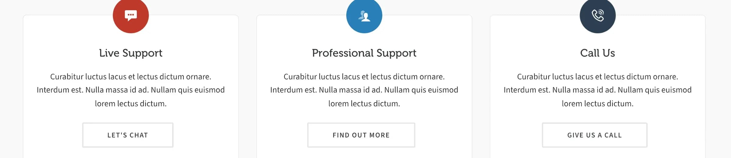
Place three [icon_box] elements inside a row of three equal columns for the classic feature-grid layout shown above.