Toggles & accordions
Build collapsible content two ways: Highend's own toggle and accordion shortcodes, or WPBakery's native Accordion, Toggle, and Tabs elements.
Highend gives you two ways to build collapsible content: its own toggle_group/accordion_group shortcodes, and WPBakery's native Accordion, Toggle, and Tabs elements, which Highend restyles to look and behave exactly the same way. Pick whichever fits your workflow; visually there's no difference.
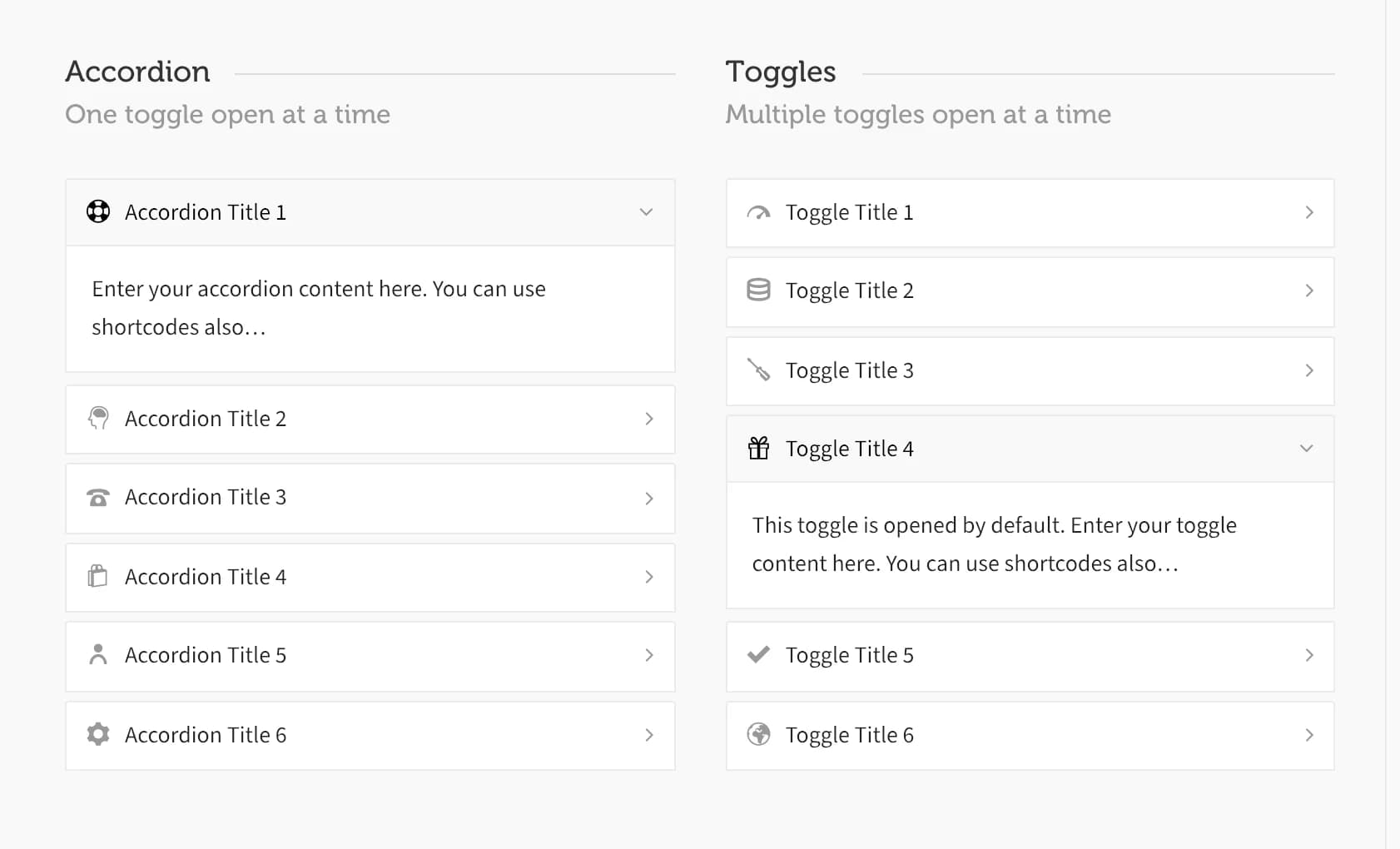
The difference between the two types is how many panels can be open at once:
- Accordion: opening one item closes any other open item. Good for FAQs, where you want visitors focused on one answer at a time.
- Toggle: each item opens and closes independently. Good for a longer list where visitors might want several sections open together.
Highend's accordion and toggle shortcodes
toggle_group/toggle_item and accordion_group/accordion_item have no WPBakery mapping, so they don't appear in the Add Element dialog. Add them as raw shortcodes, or use the Highend Shortcode Generator button in the Visual tab's toolbar on any Classic Editor screen, which inserts a starter group with two example items for you to copy and edit.
accordion_group / accordion_item
[accordion_group initial_index="0"]
[accordion_item icon="hb-moon-support" title="Accordion Title 1"]Enter your accordion content here.[/accordion_item]
[accordion_item icon="hb-moon-brain" title="Accordion Title 2"]Enter your accordion content here.[/accordion_item]
[/accordion_group]
Prop
Type
toggle_group / toggle_item
Same syntax and attributes as accordion_group/accordion_item above, with the tags renamed (the title attribute's default text is Toggle instead of Accordion):
[toggle_group initial_index="3"]
[toggle_item icon="hb-moon-meter-fast" title="Toggle Title 1"]Enter your toggle content here.[/toggle_item]
[toggle_item icon="hb-moon-database-2" title="Toggle Title 2"]Enter your toggle content here.[/toggle_item]
[/toggle_group]
Both group shortcodes also accept Entrance Animation, Entrance Delay, and Extra class name. See the Elements overview.
WPBakery's Accordion, Toggle, and Tabs elements
WPBakery's own Accordion, Toggle, and Tabs/Tour elements are still available from Add Element, grouped under the VC Shortcodes category rather than Highend Shortcodes. Highend overrides their templates so they share the exact same markup, CSS, and JavaScript as its own shortcodes above: an Accordion behaves like accordion_group (one pane at a time), and a Toggle behaves like toggle_group (independent panes). It also adds an Icon field (defaulting to hb-moon-plus-circle) that stock WPBakery doesn't have on these elements.
Accordion (vc_accordion / vc_accordion_tab)
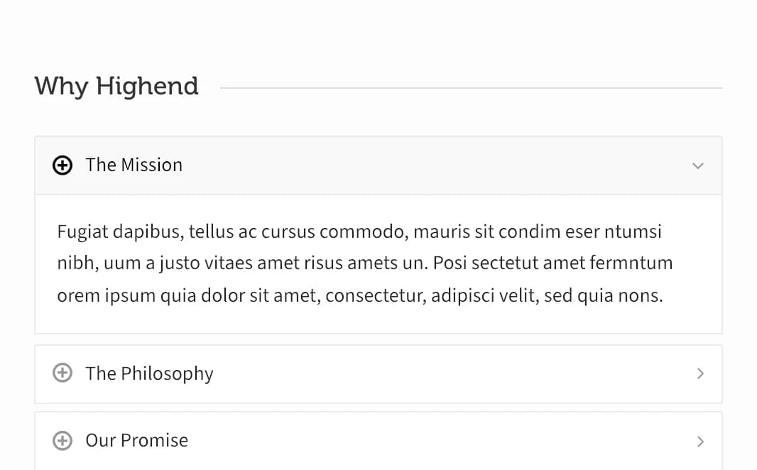
Each Accordion Tab gets Highend's added Icon field (hb-moon-plus-circle by default; clear it to hide the icon).
Toggle (vc_toggle)
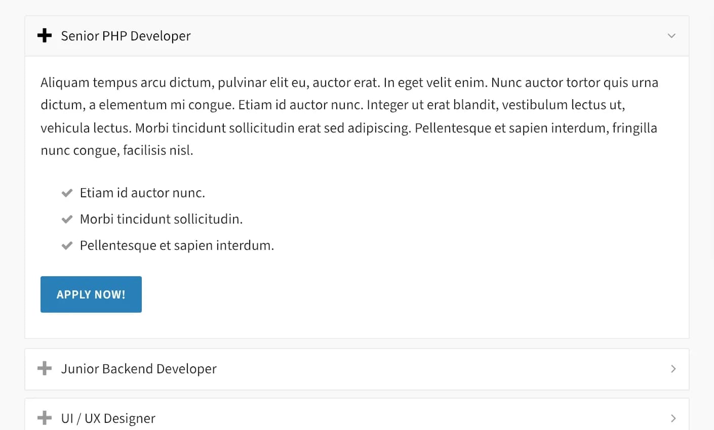
Same added Icon field, plus WPBakery's own Open by default? switch for each toggle.
Tabs and Tour (vc_tabs / vc_tour / vc_tab)
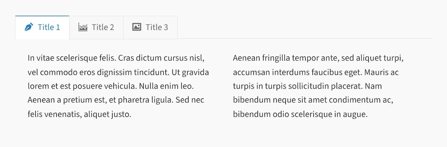
Each Tab also gets Highend's added Icon field (hb-moon-plus-circle by default), shown before the tab's title in the nav. Tour is the same element positioned with its tab nav on the left or right instead of across the top.